.someclass {
-webkit-border-radius: 100px;
-moz-border-radius: 100px;
border-radius: 100px;
-webkit-box-shadow: 0 1px 3px rgba(0, 0, 0, .4);
-moz-box-shadow: 0 1px 3px rgba(0, 0, 0, .4);
box-shadow: 0 1px 3px rgba(0, 0, 0, .4);
}
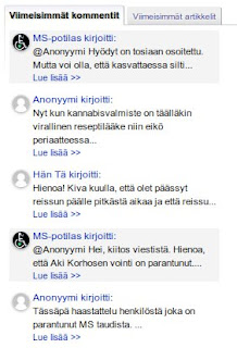
For some templates, and maybe just for a change, those rounded images can look very good. I'll show you CSS you can add to my hacks, and one Blogger gadget, to make images round. In my hacks you should add the CSS in the code before </style>.Better recent comments gadget
Add this style:
.recent-comment-ico img {
-webkit-border-radius: 100px;
-moz-border-radius: 100px;
border-radius: 100px;
-webkit-box-shadow: 0 1px 3px rgba(0, 0, 0, .4);
-moz-box-shadow: 0 1px 3px rgba(0, 0, 0, .4);
box-shadow: 0 1px 3px rgba(0, 0, 0, .4);
}

Profile gadget with post count
Add this style:
.author-avatar {
-webkit-border-radius: 100px;
-moz-border-radius: 100px;
border-radius: 100px;
-webkit-box-shadow: 0 1px 3px rgba(0, 0, 0, .4);
-moz-box-shadow: 0 1px 3px rgba(0, 0, 0, .4);
box-shadow: 0 1px 3px rgba(0, 0, 0, .4);
}

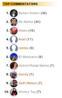
Top Commentators gadget
Add this style:
.top-commenter-line img {
-webkit-border-radius: 100px;
-moz-border-radius: 100px;
border-radius: 100px;
-webkit-box-shadow: 0 1px 3px rgba(0, 0, 0, .4);
-moz-box-shadow: 0 1px 3px rgba(0, 0, 0, .4);
box-shadow: 0 1px 3px rgba(0, 0, 0, .4);
}

Gadget for YouTube activity feed
This gives a nice "tube TV" like effect, add this style:
div.ytc_thumb img {
border:none;
-webkit-border-radius: 100px;
-moz-border-radius: 100px;
border-radius: 100px;
-webkit-box-shadow: 0 1px 3px rgba(0, 0, 0, .4);
-moz-box-shadow: 0 1px 3px rgba(0, 0, 0, .4);
box-shadow: 0 1px 3px rgba(0, 0, 0, .4);
}

Just one more, and I think you'll get the hang of it. :)
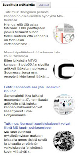
Popular Posts (Blogger gadget)
Add this style using Template Designer, Advanced, Add CSS:
.PopularPosts .item-thumbnail img {
-webkit-border-radius: 100px;
-moz-border-radius: 100px;
border-radius: 100px;
-webkit-box-shadow: 0 1px 3px rgba(0, 0, 0, .4);
-moz-box-shadow: 0 1px 3px rgba(0, 0, 0, .4);
box-shadow: 0 1px 3px rgba(0, 0, 0, .4);
}


Click on a single comment to hide/show its text
18 comments:
Those round avatars look great!
Thanks for that ♥
I really like your tips, very usefull. Thanks for sharing your knowledge with us. :)
www.karolinevendramini.com
Check this too..... :)
Show Rounded Avatar Images On Blogger Comments
I just used it on my recent items... wow!! It looks great! Thanks, L
How can I make my "related posts" round, too?
They are at the bottom of the page above the comments..
http://hippressurecooking.blogspot.it/2012/09/pressure-cooker-dulce-de-leche-condensed-milk.html
Thanks,
L
@Laura @ hip pressure cooking
Hi, great you liked these :) For the related posts, try the following CSS definition:
#related-posts img {
-webkit-border-radius: 100px;
-moz-border-radius: 100px;
border-radius: 100px;
-webkit-box-shadow: 0 1px 3px rgba(0, 0, 0, .4);
-moz-box-shadow: 0 1px 3px rgba(0, 0, 0, .4);
box-shadow: 0 1px 3px rgba(0, 0, 0, .4);
}
@MS-potilas
yay! It worked. Not the image size, though. It looks like that might be decided some other way.
I love that "related posts" sciript - it's the only one that looks at labels and not just the post titles when making a selection.
Very nice, these circles, it breaks up all the squares.
Ciao,
L
Nice But Will it Do All The Avatars Round
@yogesh mandge
Hi,
this technique rounds images belonging to the classes that are specified in the CSS code. I've given some examples on the article, and Levis Raju has an examples here for comment avatars: Show Rounded Avatar Images On Blogger Comments.
I used this for my blog, because round avatar look great.
thanks
I had been using this hack on popular and related posts and ABSOLUTELY love it! However, even with your post-supression hack I always have the same popular posts (if I supress the top 10 popular posts then non show - not your fault that is design of the widget).
So I moved to the featured post widget:
http://www.bloggerplugins.org/2011/09/featured-posts-widget-for-blogger.html
But now it looks horribly square and boring.
Any way to round those thumb-nails?!?
Ciao,
L
@Laura Pazzaglia
For ".someclass" try "div.bp_item_thumb img", like this:
div.bp_item_thumb img {
...css definitions here...
}
@MS-potilas
OK, I tried it like this:
div.bp_item_thumb img {
-webkit-border-radius: 100px;
-moz-border-radius: 100px;
border-radius: 100px;
-webkit-box-shadow: 0 1px 3px rgba(0, 0, 0, 0);
-moz-box-shadow: 0 1px 3px rgba(0, 0, 0, 0);
box-shadow: 0 1px 3px rgba(0, 0, 0, 0);
}
and nothing happened : (
I placed it in the blogger:templates:advanced:css
Then, because I'm out of my depth I also tried..
.sidebar_section img {...
and
.sidebar-left-1 img {...
But, probably no surprise to you, neither of them worked either.
Ciao,
L
@Laura Pazzaglia
There are two versions of this gadget, the first one, which you use, cannot be styled using CSS because it is in iframe. I'm afraid that neither the thumbnail size cannot be changed in the first gadget. The second one, "HTML/JavaScript Widget for Featured Posts", which may be more difficult to install, can be styled.
@MS-potilas
WOW! I installed the second script and the images are round using the same style sheet that works for popular posts you gave me originally.
The other advantage of the second "featured post" script is that you can set the image size right in there.
The "auto install" of that script didn't work but I just copied and pasted the javascript in a new widget and ... WOW!
Thank you so much!
Ciao,
L
@Laura Pazzaglia
Great! :)
@Muhammed iSham
There are many images used in templates for different purposes, and it probably won't look good, if all images are rounded. Probably some discrimination should be used. But you can try, just replace ".someclass" with "img" (without quotation marks) in the first code snippet, and put that into the CSS definitions in the template.
@Muhammed iSham
Hi, I remember that Picture Window template has rounded corners in header etc. That is probably done by some CSS, but I'm not so good in CSS that I could say how. My CSS knowledge is more or less based on Google search.
See the hack to make the 'Post a Comment' link bigger.
Post a Comment